
2 0 2 4 W I N T E R A N D S P R I N G
A R T C O U R S E S
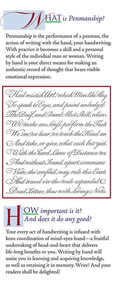
I teach calligraphy and handwriting, drawing and painting, design and composition, using traditional methods, manual tools, and the historical scripts from the original sources.
Students who seek to grow more skillful in their handwriting as a practical art, as well as students who are aiming to delve deeper into creating original works of calligraphy art, will benefit from the many educational experiences offered through my different lessons in the art of written forms.
Here, you will find my latest teaching schedule. Courses are offered in four levels of the student's knowledge and experience with the subject matter
♦ Beginner ♦ Advanced
♦ Intermediate ♦ Independent Study
2 0 2 1 A U T U M N + W I N T E R A R T C O U R S E S
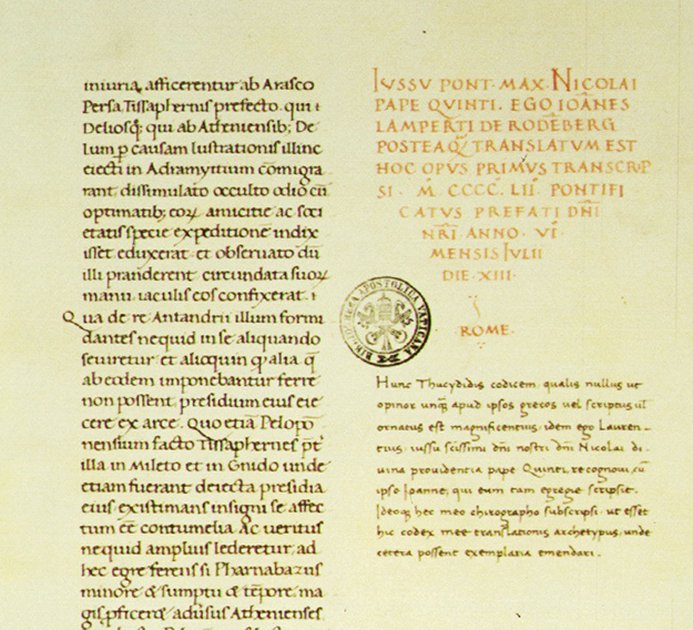
Lorenzo Valla is the Vatican scribe who wrote the document on the left, dated 1452. The document below is from Florence, 1488. The script used in both works is
humanistica antiqua / littera antiquaa, an alphabet of small letters (minuscule) and Roman Capital letters---the model
of the printing types that we still use, today.
In Italy during the 14th - 16th centuries, multiple writers made simplified alternatives to the prevailing Gothic and Black Letter scripts. Some of those writers worked as Scribes in the legal and notary professional fields, and the texts needed to be clear and comprehensible to read.
Other scholars, authors, and scribes researched and copied Latin and Greek classics from antiquity---which they found as copies, in manuscripts of the ninth to twelfth centuries.
These efforts led to the development of a humanistic "system of script"---primarily an aesthetic attempt to restore clarity, legibility, and elegance to manuscript book production. Francesci Petrarce, 1304-1374, the humanist poet, always stressed that reading and writing are essential to one's grasp of the meaning of, and capacity to understand, knowledge.
Excerpt from the book
David, The Divided Heart
by author David Wolpe.
I wrote the paragraph in humanistica antiqua
as an example of calligraphy in a straight-forward, simple arrangement.
Sumi ink on paper, of the size, 11.50 x 8.50 inches, unframed
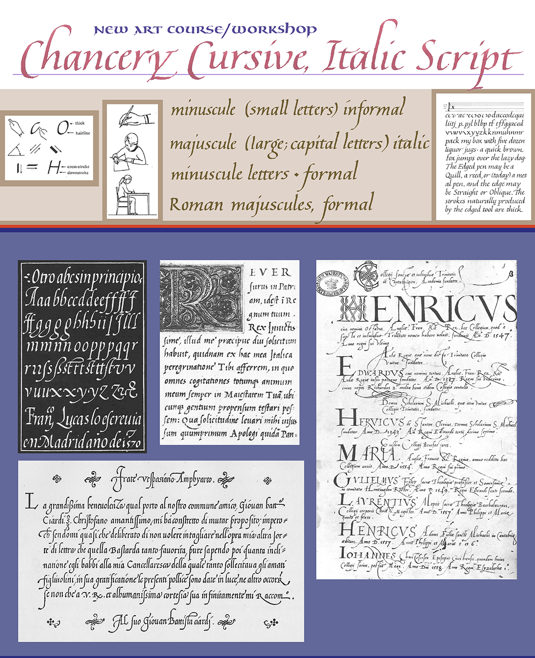
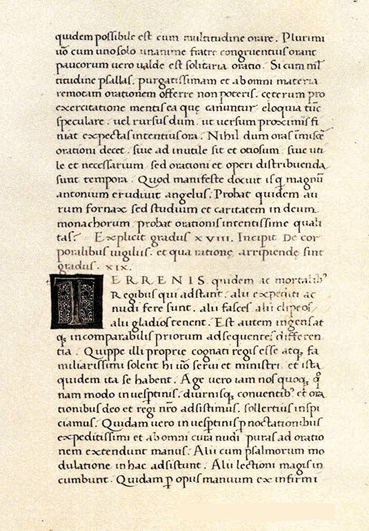
From Renaissance times up to this day, cancellaresca, the Chancery cursive, is a favored script of calligraphy and handwriting---600 long years. This slender, forward-tilting cursive was written with a square-cut quill; contemporary calligraphy and penmanship is most often written using a square- or oblique-cut metal nib.
The Humanists' systematic transformation of scripts to be more legible was also applied to letter design models in the casting of metal types. Johannes Gutenberg established a movable type–based printing press system by means of cut, or cast metal letter components.
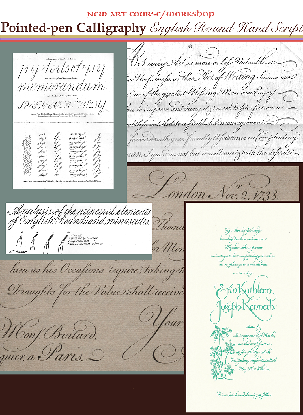
The English Round Hand evolved from a series of script variants of Chancery Cursive in the sixteenth to eighteenth centuries, when letter strokes became more rounded and a bit taller, but still slanting forward. This was a consequence of newer kinds of printing operations. The hand-writing examples of writing masters started to be engraved on copper, then printed; wood block printing had been the customary medium
for engraved reproductions. Italian, French, Dutch, and English
Model Books of Scripts were popular across Europe.
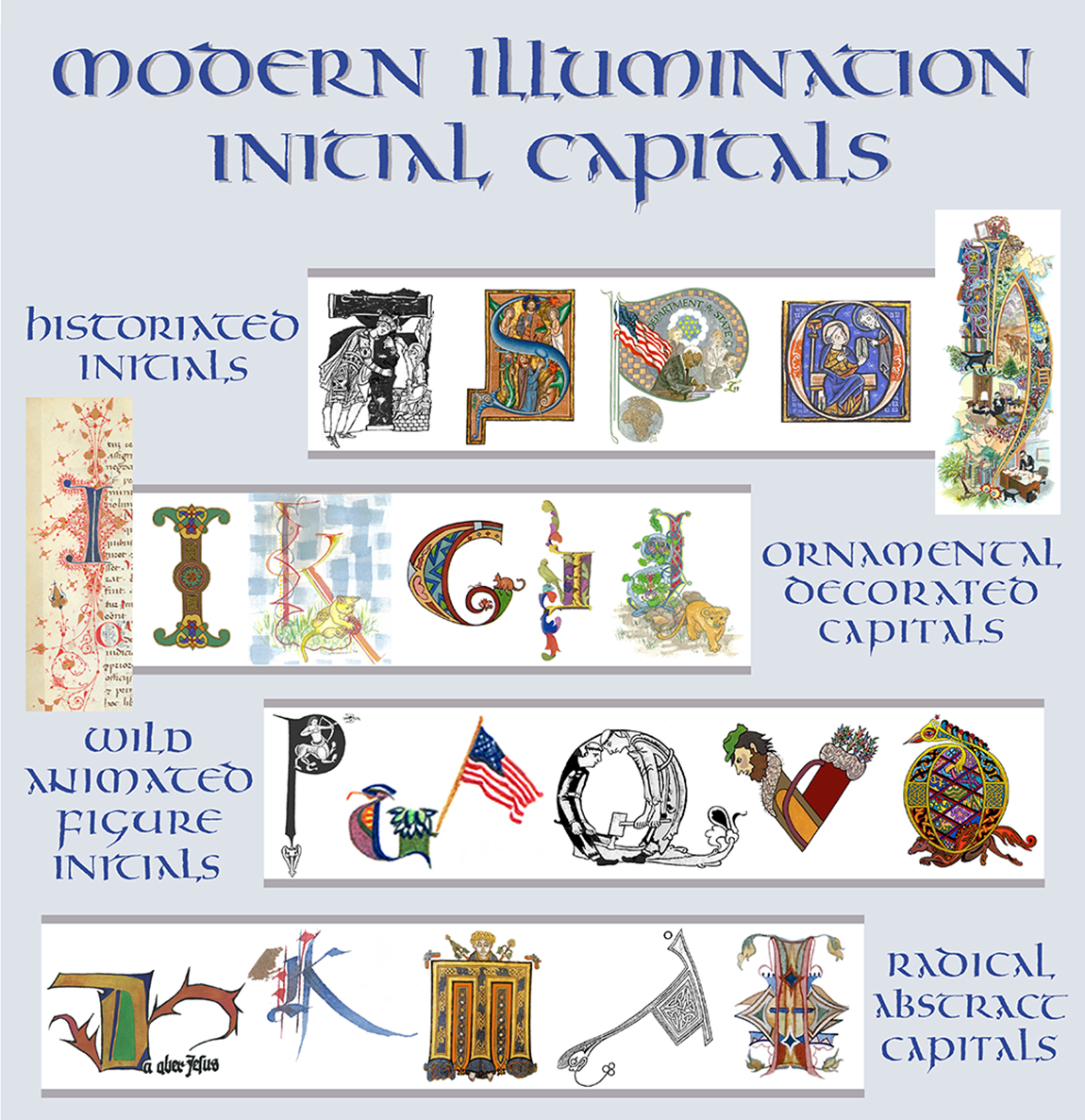
Illumination of vellum manuscripts developed in classical times from around the 2nd century B.C. – 1st century A.D., to a high art, until falling into decline and inevitable disuse in the 16th century from the advent of printing. It is neither a style nor any method for making imagery; rather,
illumination signifies books and documents that are written by hand, and which are illustrated,
or ornamented in colors---and, oftentimes gilded in precious gold or silver metals.
Illustration and Ornamentation interplay with writings in subtle ways that invite the reader to attend more closely to what a text is saying. Appearing almost any place on the page, e. g., in the wide margins; as lead-in initial capital letters; or interspersed among
rows of text---these adornments serve as a respite in the midst
of one's contemplation of the written subject. And, in whatever guise imagery presents---symbolic, fantastical, realistic, even
in the most brutal expositions of historical events---it exists
to nurture time-in-mind by the reader.
Working with one's hands on a smooth vellum surface, laying down hair-thin fine lines with a brush, quill, or pen,
full-charged with carbon soot or bright-color earthen pigment, the artist proceeds to create a world wholely reminiscent of
the natual and societal environment he inhabits.
So what might that world look like?
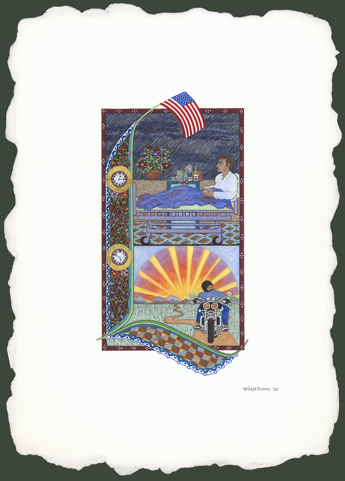
Story Of Service: Healing And Return IV
A modern illumination story of thanks-giving. It tells of one man's profound gratitude for what he believes to have been life-saving medical treatments provided to him, in hospital, at the Walter Reed National Military Medical Center. While he was in hospital, the man
also received many restorative health and wellness care services which aided him to make
a full recovery---so, now the guy has resumed doing the things he loves to do.
I drew the composition in pencil, on handmade paper,
then painted it using watercolors and gold leaf.
Size: 10.50 x 14.50 inches
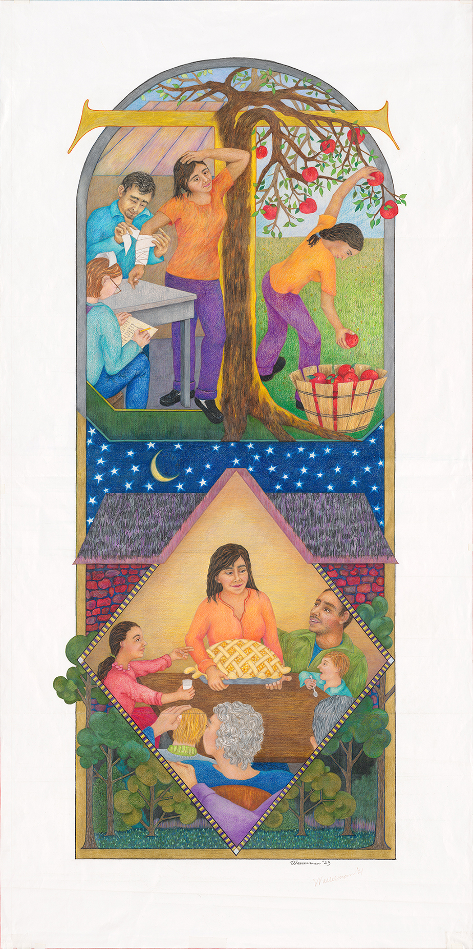
Story Of Service: Healing And Return, II
Early one Spring morning, Terèse went to see her doctor, to have the final bandages
removed from her arm. Several weeks ago, two bones were broken in her right arm
from a trip-and-fall accident. After what seemed to have been a very long time
spent patiently nurturing her body's healing process, she has regained full mobility.
So, Terèse is thankful for the medical treatment provided by the good doctor and
his health care team. All she wants, now, is to get back to doing enjoyable
activities for, and with, her family!
My drawing is a modern illumination,
composed using graphite pencil, and
completed as a finished work in colored pencil.
Actual size: 30 x 60 inches
Manuscript production in the Greco-Roman world
shifted away from papyrus rolls to parchment codices, and as a consequence new scripts evolved.
Eastern territories under Rome's control
continued to use Greek book scripts.
Greek majuscule scripts have many
round letter forms which appealed
to writers who customarily used the
Roman book hands.
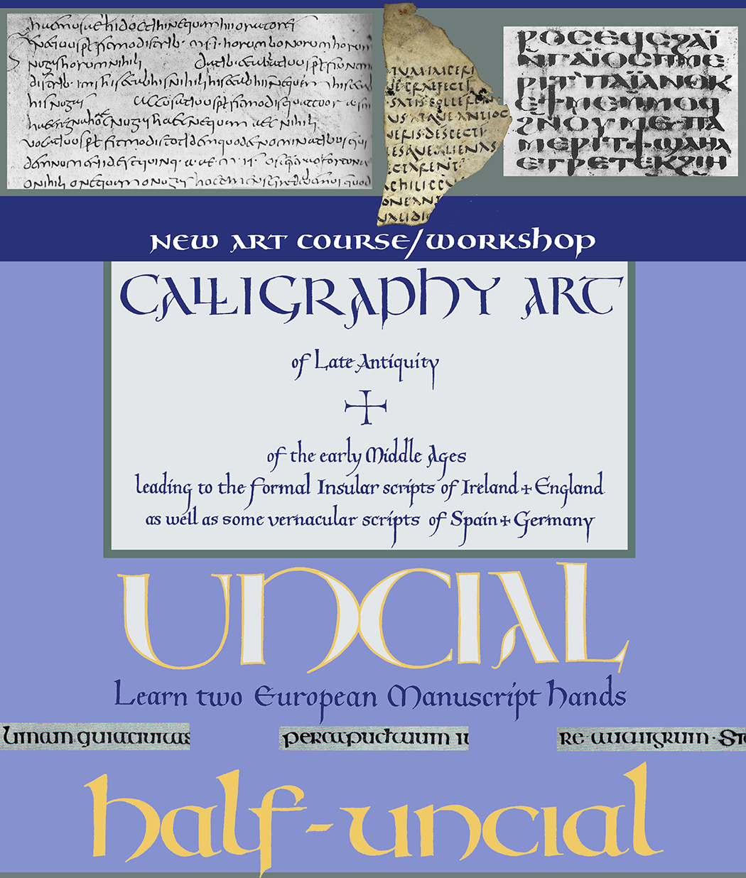
Roman Uncial / Italian Uncial) developed
out of the practice
of comb mixing together the
commonplace Latin writing hand, Roman
majuscules, with variations on some curved letter
forms of the Greek majuscules. Early in the
Middle Ages, Half Uncial developed as a
commonplace writing hand among peoples who
lived in different geographical regions;
by the sixth century, it had been elevated
to a book script.
Prehistoric peoples were learning to use their voices to speak
in ways that would be directly understood by others; at the
same time, though lacking coherent grammatical systems,
they were attempting to put their thoughts, ideas, hopes,
and dreams into writing form.
The invention of writing was a long struggle to determine
a) what the signs looked like;
b) a sign's malleable affect upon different
peoples' ways of speech;
c) how would the signs function; and
d) the correct interpretation of the signs to get
an accurate reading of the message
Cuneiform is the oldest writing system in the world---
6,000 years old, from Mesopotamia. The Sumerians invented the writing script originally to represent word meanings and ideas through pictures of things, as seen
in
nature. As time went on, these symbols were transformed into graphical signs of pure abstraction
that appeared as pointy marks in wedge-shaped
patterns upon a dense material surfacee,
e.g., clay, stone, wax, metal.
The Cuneiform script communicated actual spoken language. Signs represented the sounds of words,
and then, represented the sounds of syllables, and,
finally, all the separate sounds of the alphabet.
Egyptian Hieroglyphs
are the second oldest writing system. Incised
in rock, stone, clay, wax, and metal---pictograms and "audio-grams" were often painted on these same surfaces, as well as papyrus and animal skins. And, just as scribes did
in the Sumerian, Akkadian, and Babylonian lands, the Egyptians transformed pictorial hieroglyphs into sign symbols which,
over time, were written
as a cursive script.
Watercolor and Sumi ink
on paper, of the size,
7-3/8 x 10.75 inches
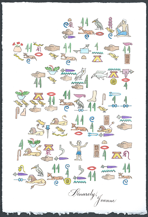
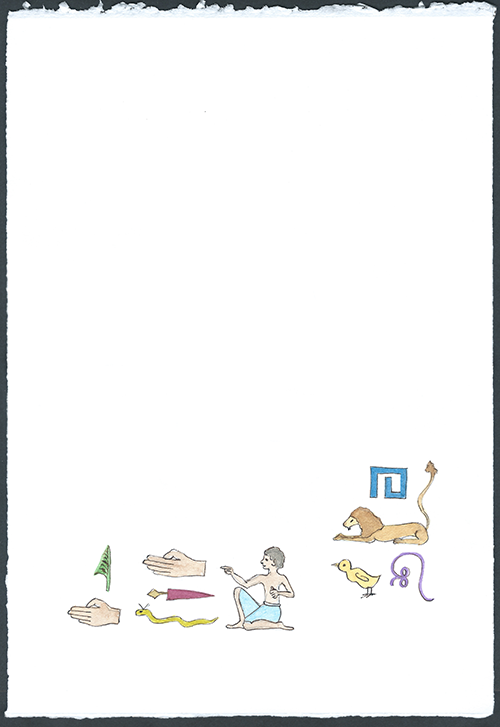
I wrote a letter in Egyptian Hieroglyphs to my friend, David, who lives nearby, with his wonderful, happy dog named Tripp. I enquired about his good health, and story plots of some novels that he was currently reading.
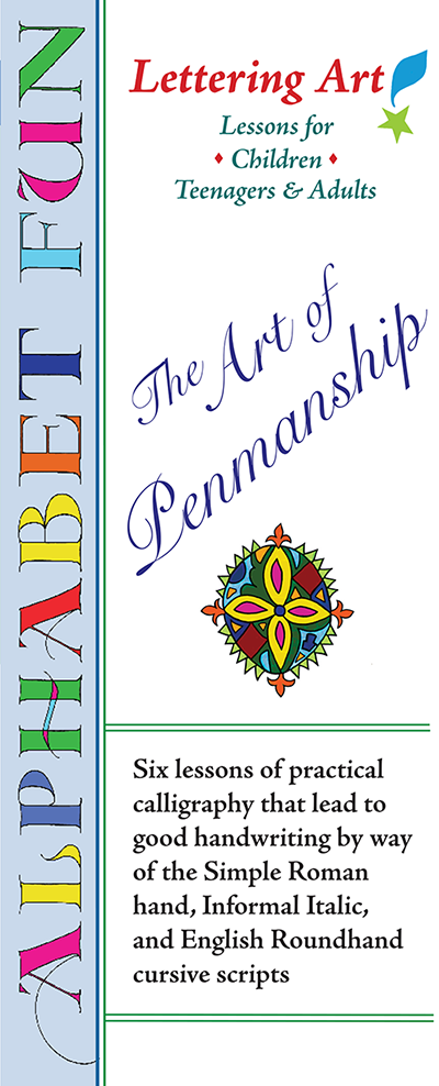
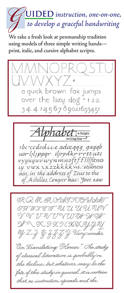
An opportunity to reacquaint yourself with the valuable labor of handwriting.
A refresher course in the letters' shapes for the cursive English roundhand, simple Roman print, and Chancery
cursive Italic script. You'll learn how to write the essential forms of 26 Capitals and 26 minuscules---from which you can see how variations of the letters are made---your own personalization, included.